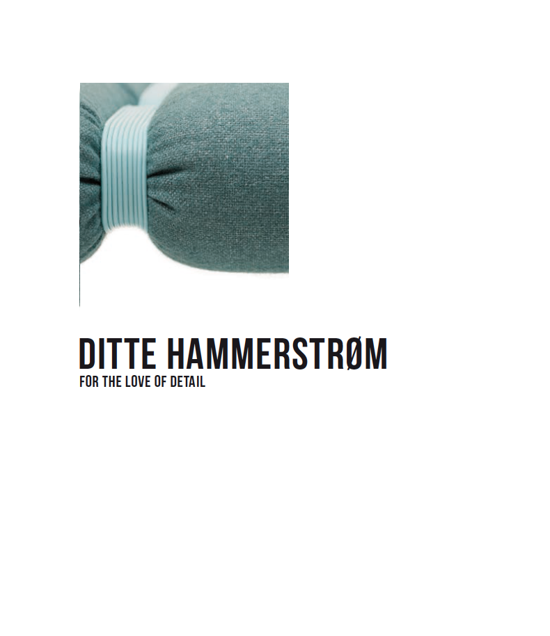
When it comes to important design pieces, upholstery often serves a functional and/or decorative role as something meant to be comfortable, resistant and/or beautiful. In most cases, upholstery is treated as an accessory to the piece of furniture, accompanying it rather than defining it. In Ditte Hammerstrøm’s furniture it is the other way around. Here the aesthetics of the surface is central and determining.
Instead of hiding the junctions, Ditte Hammerstrøm leaves them visible and enhances the beauty of attachment, literally as well as figuratively speaking.
The thin string becomes a thick rope in the work Bunch of Boxes (2008), a hanging cabinet. With an extraordinarily sculptural gesture, Ditte Hammerstrøm has eliminated all the traditional components of a piece of storage furniture – the back, front, top and legs – retaining only the essential: 10 storage boxes in various sizes suspended from the ceiling in black plaited ropes. The MDF boxes are coated with a thick luxurious lacquer, elevating this traditionally cheap material to a high level of nobility. The extreme attention to detail and the quest for exquisite craftsmanship, so perfect that it transcends even the poorest material, is remarkable.

Bunch of Boxes
2008
Hanging cabinet
Lacquered MDF wood and rope
Ca 70 x 70 x 85 (+ropes)
Limited edition of 20 ex. signed by the artist

Bunch of Boxes
2008
Hanging cabinet
Lacquered MDF wood and rope
Ca 70 x 70 x 85 (+ropes)
Limited edition of 20 ex. signed by the artist

Bunch of Boxes
2008
Hanging cabinet
Lacquered MDF wood and rope
Ca 70 x 70 x 85 (+ropes)
Limited edition of 20 ex. signed by the artist

Bunch of Boxes
2008
Hanging cabinet
Lacquered MDF wood and rope
Ca 70 x 70 x 85 (+ropes)
Limited edition of 20 ex. signed by the artist

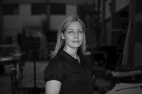
God Is In The Details…Ludwig Mies Van der Rohe once stated, and looking at his sublime Barcelona Chair one must admit that the German architect didn’t leave much to chance. The funny thing about detail is that it, to a certain extent, stops being detail when you start focusing on it. This is precisely what Ditte Hammerstrøm has been doing since her graduation from the Danish Design School 15 years ago. And in Ditte Hammerstrøm’s universe, God is a probably a She…
With the words of Mette Strømgaard Dalby, the former director of the Trapholt Museum: “The feminine decorations and colors are repeated in much of Ditte Hammerstrøm’s furniture and they help mark the fact that a generation of younger female designers has taken the lead with a vengeance. Without tending towards too many clichés, the women’s entry on the Danish design scene has created a new departure with regard to decoration.”
Can a detail be the main thing? Can decoration constitute the core? Ditte Hammerstrøm answers in the affirmative, which may seem paradoxical, yet it is nevertheless one of the main pillars of her design. The exhibition « For the Love of Detail » focuses on the role of detail in the creative process, which I believe is key to understanding Ditte Hammerstrøm’s originality. Her works are all revealing of the fundamental importance of detail, not as an addition to an already existing structure, not as an ornament, but as a trigger of new shapes, of functions and emotions: Detail in the sense of singularity, not accessory.
Soft curves & hard edges
Recognized as an important pioneer of the new Nordic design scene, Ditte Hammerstrøm has been awarded several prizes, such as the “Walk The Plank Award” in 2008 and the “Finn Juhl Architecture Prize” in 2011, and she is without a doubt one of the most interesting Scandinavian designers today. Ditte Hammerstrøm’s excellence has many facets, but one of her most original contributions is her careful attention to upholstery.
Here, upholstery should be understood in its widest possible sense, as the surface of the furniture.
Of course, to work with upholstery from an artistic perspective is not a new phenomenon. Yet even when it comes to important design pieces, upholstery often serves a functional and/or decorative role as something meant to be comfortable, resistant and/or beautiful. In most cases, upholstery is treated as an accessory to the piece of furniture, accompanying it rather than defining it. In Ditte Hammerstrøm’s furniture it is the other way around. Here the aesthetics of the surface is central and determining.
Taking a closer look at Ditte Hammerstrøm’s creative vocabulary, the cord or string seems to be a key component and forms a connecting thread, as it were. Already in her early works, such as the Bistro Light (2005), Wrinkle (2005) or the Loungescape (2005), the string appears: like a landscape the daybeds merge into each other in delicate green and yellow nuances, tied together. In a raw, yet sophisticated way, Ditte Hammerstrøm uses the string as an important technical devise in fixing the upholstery to the furniture. The gesture is free and bold and at the same time controlled. But the string also plays a more suggestive role as a trigger of playful associations.
With its lacings, the Bistro Light strongly recalls a corset; only this time, it is the upholstery and not the female body being tamed. The foam is left uncovered, without fabric, and the string is functional, decorative and suggestive – all at once. Instead of hiding the junctions, Ditte Hammerstrøm leaves them visible and enhances the beauty of attachment, literally as well as figuratively speaking.
The thin string becomes a thick rope in the work Bunch of Boxes (2008), a hanging cabinet. With an extraordinarily sculptural gesture, Ditte Hammerstrøm has eliminated all the traditional components of a piece of storage furniture – the back, front, top and legs – retaining only the essential: 10 storage boxes in various sizes suspended from the ceiling in black plaited ropes. The MDF boxes are coated with a thick luxurious lacquer, elevating this traditionally cheap material to a high level of nobility. The extreme attention to detail and the quest for exquisite craftsmanship, so perfect that it transcends even the poorest material, is remarkable.
The combination of luxurious craftsmanship and “cheap” materials finds another interesting expression in the works Wall Stools (2006) and Small Tall Stools (2007), where the plastic string, mainly known from the garden furniture of the 1970s, is inserted in the exquisite hand-crafted wood, like a punk version of intarsia. Here, the perfection is even greater underneath than on the top of the stools, something that recalls the Japanese crafts tradition.
The furniture’s tactile quality, with invisible details appealing as much to the fingers as to the eyes, is also a true heritage from the Danish golden age of handcrafted furniture design, but with a radical new twist.
In her latest work Side By Side (2014), three daybeds of different heights can be combined in various ways, working either together or separately. Each part focuses on rhythm and patterns made by repetition, and here, Ditte Hammerstrøm is once again experimenting with new types of sculptural upholstering. In Side By Side / Low Mohair the seat is made up of no less than 203 foam balls, each lavishly covered with exquisite mohair fabric. The exuberance of Low Mohair is counterbalanced by the Table-Bench with its quiet minimalistic surface and delicate plastic strings decoration, whereas the Side by Side / High Wool, indeed 62 cm tall, forms the third piece in this interesting furniture puzzle.
Furniture tends to group
As we have seen, the theme of repetition is prevalent in Ditte Hammerstrøm’s body of work, where benches, boxes and stools multiply and make new forms together. The concentration on pattern and rhythm becomes evident in her works Out of Focus (2010 – 2014). Here, several archetypical chairs in white lacquered steel are blending into one, creating an optical illusion of blurriness that makes it difficult to determine where one chair begins and the next one ends, just like, in the words of the artist, a flock of zebras on the savannah…
Besides the sculptural richness of the work, Out of Focus can be seen as a metaphor for the alternative perspective proposed by Ditte Hammerstrøm. On what do we focus? How and why? When we gaze at a star in the sky, it disappears, but by changing our eye direction a bit, looking beside or next to it, it reappears in our field of vision.
Ditte Hammerstrøm’s design is conceptually strong, and her approach to design has often been likened to that of an anthropologist. Furniture tends to group in homes through their specific function, she says. The easy chair finds the floor lamp, the sofa finds the coffee table and the dining table the dining chairs. Ditte Hammerstrøm questions these automatic gatherings by deconstructing them and allowing similar types of furniture to group and form new patterns instead.
Apparently, God is not the only one hiding in the details; The Devil Is In The Details as well, according to another saying attributed to Friedrich Nietzsche. A small error at the beginning can translate into a useless experiment at the end. Ditte Hammerstrøm definitely knows that. She knows why detail really matters.

DESIGN@HOME / April, May, June 2016
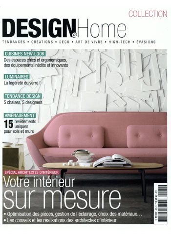
LE QUOTIDIEN DE L’ART / March 29th, 2016

BLOUIN ART INFO / June 3rd, 2015

DESIGN@HOME / April, May, June 2015
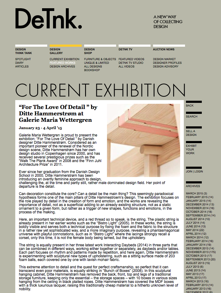
DETNK / February 2015
MILK DECO / February 28th, 2015

QUOTIDIEN DE L’ART / February 20th, 2015
YOOKO / February 11th, 2015

PARIS ART / January 24th, 2015

ELLE DECOR ITALIA / January 16th, 2015


